We all know there are many artists behind the fantastic artworks and games we all view and play everyday. Today I am pleased to be able to show some of that work for Star Wars – The Old Republic game. Artist Ryan Dening recently caught my eye with one of his StarShip designs which lead me to find him working on this fantastic, and realistic gaming art. He and an extremely talented Art Team have designed many new creations for this game… one of which you will now read and view about from Ryan Dening himself…
To contact Ryan Dening direct, please click HERE! To visit his site, please click the banner link below…
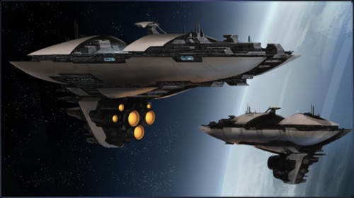
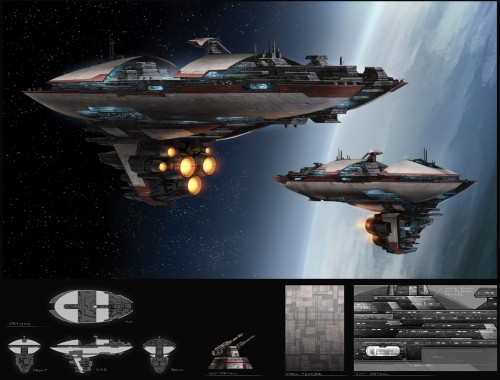
The Republic Capitol ship shown in this concept art was originally going to be smaller, but we realized in the sketch phase that we needed something that could go up against our Star Destroyers. We already had a design for the Sith Empire’s Capitol ship so we wanted something that contrasted it in silhouette and design language.
Our classic Republic style is similar to what we see in the trilogy, except that we try to make sure there are rounded elements that stand apart from our angular Imperial designs.
When creating this design, my major inspiration was drawn from the medical frigate and rebel transport; those ships are some of the coolest looking because of their odd shapes and ‘greebles’. I tried exploring some ideas based on these, but incorporated smooth, cleaner looking shells that related to other ships we’d already designed. I also wanted to make sure this ship felt somewhat tied to the Endar Spire from KOTOR.
In the end, I think we got something that hits the notes we were going for and looks really cool modeled in the game.
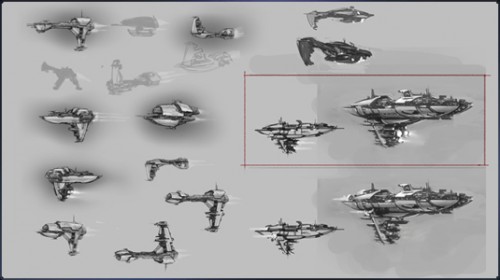
I started with some rough thumbnail sketches (left side). Once we decided to make the ship bigger, they all felt too small or similar to existing ships (left side). I took some of the elements I liked and did a couple new designs that had the mass and feel we were hoping for. Ultimately, we went with the ship design highlighted in red (right side).
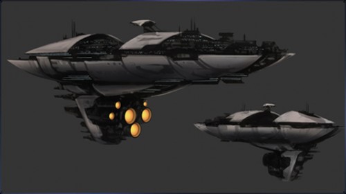
Next, I took the sketch and scaled it up to a higher resolution. I broke out my silhouette on a top layer to help me keep it down the road. After defining certain elements like the hull and engines, I went on to add lights to make sure the scale was going to work. I flipped my rough and painted over it to get the front view (bottom right).
At that point, I painted my background in to make sure the colors I was going to use would work over the entire image. I added some highlights to the larger shapes, which helps break them up and adds form and volume to the ship. I then added in some loose detail to hint at decks and technology, and varied the windows a little for scale.
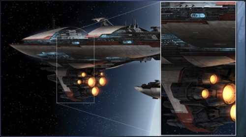
Then I added some panel detail by creating simple texture and warping to fit the shape of the hull. I continued to refine the details and added lighting under the shell (I imagined Tie Fighters could crash into these areas during a dog fight). I also added some red paint in keeping with the theme of our existing Republic fleet.
The main concept is finished. I kept the front view loose because the people building it in 3D only need information on the shapes. If you click on the image for a larger view, you’ll see at the bottom I did call-out to help the model builders. The top/front/side/back views (‘orthos’) help them understand the shape better since the painting is at an angle and is only seen from the side.
To visit Lucas Arts, please click the banner link below..
To visit the BioWare site, please click the banner link below…
To visit the Star Wars – The Old Republic Site, please click the banner link below…

